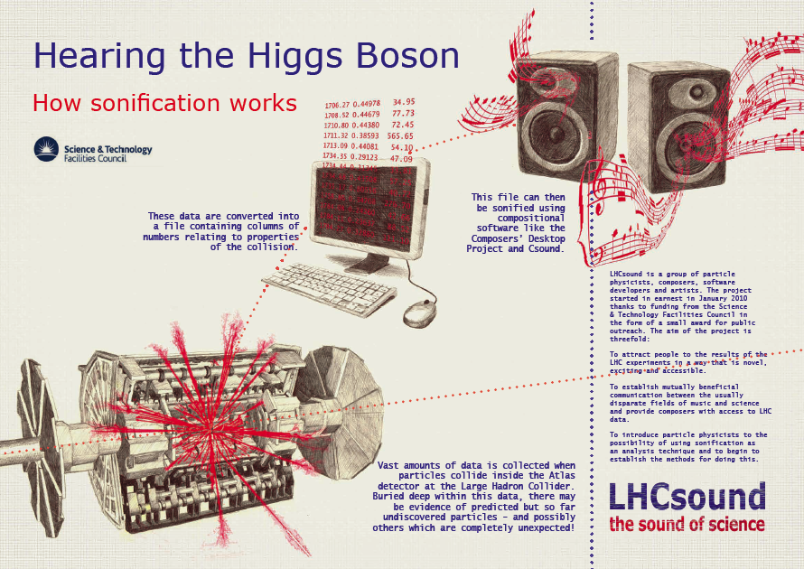
 Physicist Lily Asquith recently wrote an interesting and accessible piece on quarks, which was featured on Jon Butterworth's excellent Life and Physics blog. Included within the post was an interesting depiction of physicist Murray Gell-Mann, as provided by illustrator and artist Toya Walker. Toya also happens to be the individual behind the imaginative and colourful imagery associated with the LHCsound project – many of which are used to help explain some of the complex concepts behind the process of sonification and particle physics.
When attempting to communicate complicated ideas and concepts we often turn to visual aids to help translate information into an easily digestible format. We perceive the world from a predominantly visual perspective, meaning that illustrations and diagrams are an often more effective mode of communication, especially when dealing with higher levels of complexity. For example, an annotated diagram of the heart is often much easier to understand than a detailed description of it's anatomy. However such 'diagrams' can be uninspiring and do little to engage with those not already interested or familiar with the subject concerned.

The use of visual metaphor and analogy can thus be very helpful in reaching out to a wider audience; for example one of Toya's images depicts the Higgs Boson as the ‘Golden Snitch’ (as found in Harry Potter) in a humorous and accessible reference to the elusive nature of the particle. As such visual imagery is tasked with the responsibility of translating specialist information into a language that is easily comprehendible but also appealing to non-specialist audiences. This is what I appreciate in Toya's work. Even in a project that is primarily concerned with conveying information through sound, there is still significant emphasis dedicated to the use of visual imagery to explain key concepts. As a result, the project opens up the Large Hadron Collider (and the excitement associated with it), to those who may have once been alienated by it's complexities (like me!).
I obviously really like the work Toya has produced for the project, so I got in touch with her to find out a little bit more about how she got involved and developed her illustrations. You can check out her website and blog to have a look at of her artwork, but in the mean time she was kind enough to answer some of my questions and provide some early sketches; you can read her responses below:
Do you have a background in science?
I always enjoyed science at school and took physics at A-level, but not beyond that.
How did you come to work on the LHCsound project?
I met the initiator of the project, physicist Dr. Lily Asquith. The project, of course, was fascinating but what really made me want to get involved was Lily’s passion for communicating the ideas of the project, and indeed the work going on at the LHC, with as large and diverse an audience as possible.

Did your perception and understanding of the LHC change as you developed this work?
Yes, definitely, I did quite a lot of reading to try and understand as fully as I could some of the concepts we were trying to communicate. Learning more really ignited my sense of wonder, its almost like magic, but real. I think physics is often seen as difficult and therefore dull, part of the reason for doing the project was to communicate how exciting it actually is.
A lot of the science and ideas associated with the LHC are quite abstract in nature; did this make it easier or more difficult to create a visual aesthetic?
A great deal of my working practice involves images drawn from observation so the abstract nature is definitely challenging, but in some ways liberating too. With the project, there were so many approaches that sprang to mind, the real difficulty was choosing a direction. I felt my role was to realize the artwork in the way Lily would visualize it, as she has a very unique and approachable way of talking about particle physics.
In one of your images you’ve depicted the Higgs Boson as the ‘Golden Snitch’ (from Harry Potter), what was the reason for this?

To add humour, I guess, and a reference that might communicate the idea of the search for the elusive Higgs in an accessible way.
Your work in this project has been important in helping to communicate complex ideas in a simpler manner – how do you think art and illustration can help communicate complex ideas and allow people to engage with them?
I think its fundamental, particularly if the goal is to communicate to as large an audience as possible. I’m involved in education work, including the Picture It project run by The House of Illustration. The aim of the project is to use illustration as a learning tool in the classroom for cross-curricular benefit. They’ve done some wonderful work including sessions where primary school children made their own books, with every page showing a different stage of the process of a volcano erupting. Or secondary students used collage to show the effects of different forces. I think it’s such a brilliant and effective way of learning.
In science information is often communicated graphically in visual form. Scientists would often see this as an objective representation of information – but as an artist do you think such representation can take on an additional expressive form?
I find data visualization really interesting and I often look at the work at http://www.informationisbeautiful.net/. There are brilliant ways of communicating vast amounts of information. None of the imagery made for LHCsound was trying to communicate data, just ideas and we definitely made a conscious effort to develop the pictures in a different way, or a style not traditionally associated with science textbooks for instance.
Toya Walker is an illustrator and artist who lives and works in South London. A graduate of Edinburgh College of Art she has an eclectic approach to image making but drawing and painting form the basis for all her work. Her illustrations have been used by The Viral Factory, Atlantic Records and the LHCsound project and work has been shortlisted for The Jerwood Drawing Prize, The Dulwich Picture Gallery Summer Exhibition and The Mall Galleries Royal Society shows.


 Physicist Lily Asquith recently wrote an interesting and accessible

